Friday, December 7, 2012

weiners!!!!!!

1. Explain how you changed your photo in the lab to create a stencil.
in photo shop i added a black and white filter to change the picture.

2. When creating the collage background explain your choices of colors, materials (magazine paper, books pages, etc), and placement. How does it relate to your topic? If no relation discuss general idea.
i wantged to choose food to go with the vehicle because i chose the oscar mayer weiner mobile, the colors and placement were random.

3. Discuss the way positive and negative space was used to create your stencil
we cut out the black or negative space to create the stencil.

4. When using the xacto knife, explain the safety procedures, how to use the knife and any challenges you had to overcome while cutting.
we had to be careful with the xacto knife and always covered the tip when you are not using it, it was hard cutting circles with the exacto knife.

5. How was your experience with the spray paint? Discuss how color choice is important, placement of stencil, and any other concepts you noticed while creating this.
the sprypaint was easy to use i wanted yellow and red (ketchup and mustard) to go with the weiner mobile but we didnt have red so i used pink. 

mr potato head

. Describe the process you went through to change your object into the correct perspective to create the drawing. This is when you were in the lab.
first we went to photoshop and stretched out the picture, then we put 1inch grids on it and a piece of paper and started to transfer the picture to the paper square by square then color it in .

2. How did distorting and stretching the object allow for you to create a drawing that would look different to the viewer?
it looks steretche d looking straight at it butat an angle it looks the correct size and porportions.

3. What were the most important concepts in the project to make it successful?
the most important concept was to stretch the picture and transfer it exactly to the new sheet of paper.

sorry!

Honestly I didnt like this project because of the watercolor. But I really like drawing in perspective. The project came out well i liked overlapping the watorcorlor and the colored pencils to add layers of color.the vanishing pojnts didnt eork though it was haprd to use them when they were off of the paper. if i did this again i would be more carefukl with the watercolors. the most difficult part of this project was the watercolors because they were hard to control them where the wateercolor went. i learned how to apply perspective to art. 

Monday, October 22, 2012

Balls the fish

1.     Describe the overall composition of your artwork (balance, unity, rhythm and movement).
  The overall composition of my artwork is pretty good, it flows from the dark to the light spaces and those are balanced in the print.
 
2.     How did you add texture and contrast to your print? Is this important? Why?
I added texture and contrast to the print by using thick and this lines, it is important because it shows the different backgrounds. 
3.     Explain how you used positive and negative space to show your image.
I used positive and negative space to create images like different plants and details in the fish and sand.
4.     Describe the craftsmanship of your print. (How good the project is technically crafted)
The project from a technical standpoint is great, its neat and there is very little wrong with the ink.

5.     Were you able to achieve depth by showing a foreground, middle ground and back- ground? Explain.
Not really, it looks 1D for the most part.
 
6.     Explain your experience with Printmaking. What were the obstacles and advantages?
I liked the project it was more technical skill than art skills so it worked for me it was hard to make a strong picture but easy to cut.
 

Thursday, October 4, 2012

chalk

1. Explain your experience working on a team and executing your ideas for the mural.
The experience was great. During the project my team all did their share of the work. our idea was transfered perfectly to the wall.
2. Explain the importance of collaboration when working on a team.
Team work is very important. First off one person cant do this project by himself. Secondly everyone has  different talent and they all were put together to make a great final copy.
3.  How successful was this project? Explain how and why.
I think this project was very successful. We all leared how to shade and use chalk better after this project. We did this through just using chalk so much and shading and blending everything together.
4. Explain how you feel about creating artwork that others can interact with. Ex. Invoving the whole school? 
I love making interactive art. It makes me feel good that others can enjoy my art other than looking at. I love seeing people look through the telescope.


animals gone wild!!!!!!!!!!!!!!!!!!!

1. Why is texture so important to have in your sketches?
The texture is important because you need to have good texture on the print block if it is to turn out good on paper. 
2. Why is it neccessary for you to have several references of each animal and each background? Explain.
Its neccessary to have many referances because you need more than one view of something to draw it and its needs to be youre own, you cant just cpoy a picture.
3. When you look at your sketches are you able to see which sketch is the strongest and will make the best print? How do you know this? 
I have done this project before and i know that the blue footed booby picture will be the best because its has lines that are easier to carve and i like it the most of all of my drawings.

Friday, September 21, 2012

                                                            
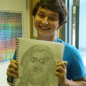
1. Explain the process you went through to develop your drawing.
The first step i did was to trace the values onto the tracing paper.  After that i colored over the back of the tracing paper to make the valeu lines easier to see. Then i transfered it to my sketch book to get my final piece.

2. Explain how you found the different values in the portrait?
To find the different values i had to look at the shadows on her face. We took the pictues by the door so the sun made lots of shadows all over the face. The different shadows were later shaded differently but on thwe tracing paper they were just shapes.

3.  Did you achieve a full range of the different values within your portrait?  How?
First i had to make a vaue chart. Then i transfered the tracingpaper value areas to my sketchbook. After that i used my value chart and the original picture to create the different values you see in the final drawing.

4. Describe your craftsmanship.  Is the artwork executed and crafted neatly?
My craftsmanship is terrible. It looks like picasso jacked up one of his paintings. But the lines are neat and the shading is pretty close to the original picture.
5. List any obstacles you had to overcome and how you dealt with them.
To do this i had to overcome the fact that the girls across from me and to my left made me look like im drawing kindergarden sketches. Also my person had lots of hair which was hard to draw. Finally i had drawn my value lines too dark and tht messed up the shading.